![]()
Background
NextGen Healthcare identified Women’s Health (OBGYN) as an area of focus to increase the number of signing from 10 net new outside the base per year to 20 per year. Discovery was done to learn more about the user problems.
The Problem
WHAT THE CLIENT NEEDS TO CHANGE
As an obstetric provider, I’m trying to familiarize myself with a patient before and during an appointment so I can provide accurate care but, I need to access multiple screens in different locations of the EHR which makes me feel frustrated by increasing time inefficiency and worried that I might miss something endangering patient safety.
Hypothesis
POINT OF VIEW TO BE PROVED OR DISPROVED
Introducing a consolidated and intuitive user interface within the Electronic Health Record (EHR) system will reduce time inefficiency for obstetric providers in accessing patient information across multiple screens and locations, thereby enhancing their familiarity with patients before appointments and improving overall patient safety.
Research Goal
WHAT WE HOPE TO ACCOMPLISH
To develop a convenient healthcare experience for providers and their patients
Research Objectives
HOW WE WILL GET THERE
-
Understand Current Workflow:
-
- Determine the current workflow of obstetric providers when accessing patient information in the EHR system.
- Identify pain points, challenges, and inefficiencies experienced by providers during this process.
Assess Information Needs:
-
- Identify the specific types of information obstetric providers require to familiarize themselves with patients before appointments.
- Determine the frequency and importance of accessing different types of information for providing accurate care.
Evaluate EHR Navigation Patterns:
-
- Explore how obstetric providers navigate through different screens and locations within the EHR system to access patient information and how long it takes them, on average, to do so.
Gauge Impact on Patient Safety:
-
- Assess the perceived impact of the current EHR system’s usability on patient safety.
Prototype Testing and Feedback:
-
- Develop prototypes and gather feedback from obstetric providers through usability testing to evaluate the effectiveness of the proposed interface in addressing their needs and pain points.
Measure Efficiency and Satisfaction:
-
- Quantify the time efficiency improvements achieved through the streamlined user interface.
- Evaluate provider satisfaction levels with the new interface design and its impact on their ability to provide accurate care.
-
MY ROLE
- Lead Product Designer
TOOLS USED
- Figma
- Miro
- FigJam
- User Interviews
- User Testing
- Lyssna
DURATION
- 1 Year
Research Plan
My Process: A research plan was developed and created to identify the problem, create a hypothesis, and establish objectives.

01
EMPATHIZE
02
DEFINE
03
IDEATE
04
PROTOTYPE
05
TEST
01
EMPTHAIZE
User Experience Map
THE APPROACH
Research the provider encounter workflow
THE REASONING
To get a sense of activities and tasks a provider takes before, during, and after seeing an obstetric patient.

SME Interviews
THE APPROACH
Conduct interviews to understand the challenges obstetric providers have before, during, and after an encounter.
THE REASONING
SMEs see pregnant patients all the time and have an understanding of what the process is like using the current electronic health record.

FINDINGS
Providers currently do have a way to share notes or non-clinical information regarding a patient.
INSIGHTS
Providers need to share notes with the team as well as like to add personal notes regarding a patient to add that personal touch.
DESIGN DECISION
Include a Sticky Note where providers can add, edit, and delete notes. It will time-stamp the post and who posted it.
FINDINGS
Providers sometimes look up patient profile information during and after an encounter.
INSIGHTS
Looking up patient information during an encounter leads to extra work and clicks. It can also throw a provider off from what they were doing and thinking.
DESIGN DECISION
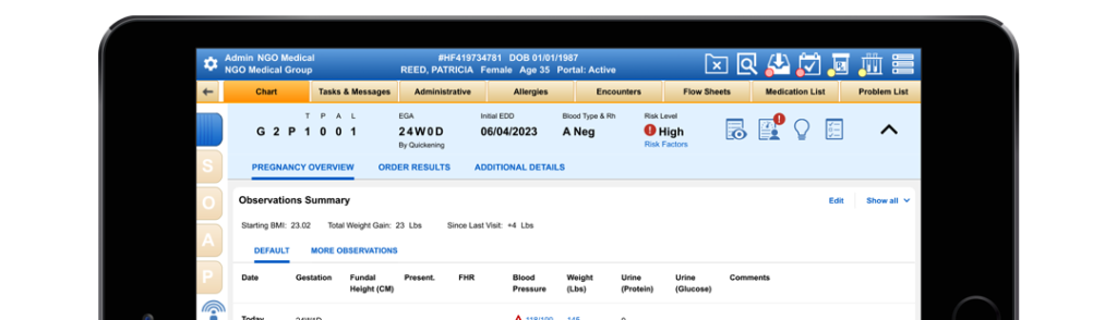
Allow the provider to access the patient information without leaving the encounter or losing where they were. Utilize existing patient banner structure which pre-exists on every page in the workflow as entry point to summary information.
FINDINGS
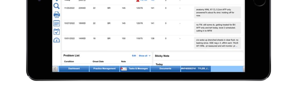
When sending the Antepartum Form to the hospital to prepare the medical staff for a patient to give birth, the observation notes for each visit would get cut off after the first three lines of text.
INSIGHTS
Providers created workarounds such as limiting their notes to three lines of text or faxing the last encounter to include the full observation notes. Providers felt it was important for the hospital to receive the full observation notes to provide better care. This added time, stress, and financial burden. The customer could be charged extra for faxing more than the set amount.
DESIGN DECISION
Update the format of the Antepartum Form to expand and include the full observation notes for each visit to ensure the medical staff can provide accurate care.
FINDINGS
There are 20 common observations. Some observations are relevant in every visit. Others are less important or play a factor at different stages of a pregnancy.
INSIGHTS
Providers can be overwhelmed with too much information. They want to see the most important information first.
DESIGN DECISION
Have the priority observations as default in view and the secondary observations accessible when needed.
FINDINGS
G&Ps, EGA, EDD, and blood type, are regularly referenced by providers and medical staff. Changes to this information happen often as the pregnancy and tests progress.
INSIGHTS
Having this information readily available to all staff without having to dig for it would save the staff time.
DESIGN DECISION
Display the information in a sticky banner at the top of every page in the OB workflow. Allow the provider to click to expand to see more information (summary, demographics lab results). This allows them to stay in the encounter but still access the information.
FINDINGS
The problem list is also very important for providers to review to familiarize themself with a patient. Some items on the problem list can also be marked clinically significant.
INSIGHTS
For some patients, the problem lists can be long but for others short. Clinically significant problems need to stand out. providers can easily be overwhelmed with lots to look at.
DESIGN DECISION
Place this towards the top of the summary and show the last 5 problems but give the ability for the provider to see all so they are not overwhelmed. Utilize clinically significant star icons to make them stand out. Clinically significant items get arranged at the top of the list.
FINDINGS
Medications and allergies are currently on the existing summary page. That page does not have pregnancy-specific information.
INSIGHTS
Having pregnancy-specific information along with allergies and medications in one place would save the provider time from going to multiple locations.
DESIGN DECISION
Include medications and allergies in the middle of the OB summary. Allow for flexibility in the number of medications and allergies as they could vary in patients.
02
DEFINE
Team Sketches
My Process: Sketches were made based on information that was gathered during research.

03
IDEATE
Wireframes*
My Process: I created wireframes with detailed annotations. We made UI decisions based on insights, user needs, and other research information:
RESEARCH-DRIVEN INSIGHTS
- Moving all relevant information to one spot
- Included Sticky Note
- Easy open and close access without leaving the encounter
*Unfortunately, I do not have a copy of what these looked like.
UI Kit
My Process: The product was several years old and had little or no UI components in Figma. The team needed to start working on designs while the UI components were being rebuilt.

04
PROTOTYPE
High Fidelity Prototype
My Process: I built a high-fidelity mockup and prototype to be used for usability testing. This included mockups for three scenarios and two flows.

05
TEST
Usability Testing Plan
My Process: A usability test plan was created with an introduction, script, and pre-planned scenarios and follow-up questions. Participants matching the demographic were recruited for the test. It was recorded and notes were kept.
Usability Test & Results
My Process: Participants matching the company demographic were recruited to test the usability of the prototypes.
The users were given multiple scenarios. The sessions were recorded and notes were taken on the actions of the participants.

Affinity Map
My Process: All of the observations, notes, and comments were organized into an affinity map to identify pain points.
The information was then organized into actionable items. Iterations were implemented and sent for further testing and review.

Iterations
Finding: The same patient information was repeated twice while a patient chart was open.
Insight: This bar and structure already exist on every page in the workflow when a patient chart is open. This space could be repurposed to provide more value.
Design Decision: We removed the redundant information, used it to show Obstetric information providers regularly referenced as well as turned it into the summary page access point.

Iterations
Finding: Users referred to this information often, but it was easier to see at the top of the patient chart.
Insight: This information was redundant and not utilized at this spot.
Design Decision: It was removed and allowed more space for the other content. Users can see the same info larger at the top of the patient chart.

Iterations
Finding: In terms of timing, the EGA should come first over the EDD.
Insight: These dates and settings would need to be updated as they got more information during the pregnancy.
Design Decision: The location was swapped and information was stacked for better legibility

Iterations
Finding: For blood type, “Neg” or “Pos” were often used. They liked seeing RhoGHAM info but it was lacking more info.
Insight: The RhoGHAM shot could be given more than once and dates were needed as well.
Design Decision: RhoGHAM was removed and would be addressed in another(more appropriate) location where more information could be provided. Negative and Positive were abbreviated. This also is less visual clutter.

Iterations
Finding: Two different alert icons were being used for the same meaning. Tobacco use
Insight: Many Providers were not familiar with the risk factor capability and were not using it
Design Decision: We changed the alert icon so there was only one. A link was added under risk levels to the risk factors section so Providers could fill out the information if desired.

Iterations
Finding: Some vitals were more important to OB providers than others.
Insight: Providers liked seeing information holistically all at once over time so they could get a bigger picture of the patient’s history.
Design Decision: Some vital signs were moved that were less important. Other information was called out above the chart for quick reference. The Provider was shown information from the last 5 encounters but could click to see all if desired.

Iterations
Finding: The Observation notes were the first thing providers read to help prepare for a new appointment with a patient.
Insight: Providers needed to see that information historically with other information from a prior encounter.
Design Decision: The vitals and encounter notes were combined into one holistic chart to allow the user to see changes over time. They also could click links to see trends. To not overwhelm the user, a decision was made to show the last 5 encounters, with the ability to show all if desired.

Iterations
Finding: The users wanted to be able to quickly delete some messages that were no longer valid or important.
Insight: Having individual messages instead of one giant post would allow users to add/ edit or delete individual messages easily.
Design Decision: The notes were changed to individual posts, with their date and time so users could easily delete notes without having to edit the entire post.

Iterations
Finding: The users felt it was important to know who posted each message just in case they had a question.
Insight: Adding an author to the note would allow the user to ask questions to whoever posted it.
Design Decision: A timestamp with the author’s date and time was added below each note. If the note was edited, it would move to the top of the list.

Handoff
My Process: After multiple rounds of iterations, the project was ready for handoff to the developers. A link to the Figma file was added to Confluence. The file had annotated notes to help further explain changes.

Post Launch Survey
User Satisfaction Rating: 4.4/5 stars
How disappointed would you be if you never had access to this feature: 4.2/5 Stars

Sailboat Retrospective
The team did a Sailboat Retrospective exercise:
- What helped to move us forward
- What made us feel good
- What held us back
- What are future risks

Personal Conclusion
Insights: It was important to figure out how providers work and what triggers them to take action.
Challenges: This was the first time the company reached out to its users and recruitment for interviews and usability tests was initially a struggle.
What I learned: There were prior features or elements that users failed to adopt, but because there was clinical data tied to them, we could not remove them.
What could I have done differently: Ask earlier on for training for myself and my teammates on the OB workflow.
What next steps would you take to further improve the project: Have recommended features to appear in the summary page, but allow different specialties to turn on or turn off different things.
Key Takeaways: Usability tests can help uncover how users are using the product in ways that are unexpected.
What am I most proud of: The reported time-saving on average of 10 minutes per patient. Practices saw an average of 18 patients per day.
READ MORE
Case Studies

getBetter
A mobile app that guides users to recovery post foot surgery

Patriots First Foundation
A responsive website that nurtures donor behavior

Child Life on Call
A mobile app that supports parents preparing their child for a hospital visit