![]()
Background
Parents who have children in the hospital tell Child Life Specialists they feel scared and overwhelmed. Our goal is to help you feel fully involved in your child’s care, and empowered to make confident and informed decisions about their health.
The Problem
WHAT THE CLIENT NEEDS TO CHANGE
As a parent of a healthcare patient, I experience challenges taking everything I’m learning about my child’s healthcare needs and trying to help them understand what’s happening. This affects me because I feel stressed that I am not communicating in a comforting, reassuring, or positive way. An option to have strategies and tools to have conversations and interactions in the useful information I have access to in the Child Life On Call app will help solve this problem for me.
Hypothesis
POINT OF VIEW TO BE PROVED OR DISPROVED
Adding a function or feature to guide the parent through meaningful conversations and interactions, will allow them to communicate in a more comforting and reassuring way to ease their stress.
Research Goal
WHAT WE HOPE TO ACCOMPLISH
- Understand what makes a parent feel more or less stress
- Figure out how parents can effectively communicate what to say, how to keep cool to help put an end to the power struggles and hardships
- Learn how parents can be more comforting and reassuring so their child feels at ease
- Understand words and activities that make a child more comfortable and reassured
- Help guide parents through difficult topics and conversations
Research Objectives
HOW WE WILL GET THERE
- Understand what tools and techniques Child Life Specialists try to educate and teach to the parents and why they do it.
- Understand how these methods help lead to positive outcomes and less trauma
MY ROLE
- UX Researcher
- UX/UI Designer
TOOLS USED
- Figma
- Adobe Illustrator
- Miro
DURATION
- 80 Hours
Research Plan
My Process: I developed a research plan to help set expectations and document the essentials I needed to communicate to stakeholders and the product owner. I want to make sure the research scope and focus is on target and I’m not introducing unnecessary information.

Project Roadmap
My Process: I created a schedule of what would be produced and accomplished. This helps keep the project on task, on time, and on budget.

01
EMPATHIZE
02
DEFINE
03
IDEATE
04
PROTOTYPE
05
TEST
01
EMPATHIZE
UX Audit
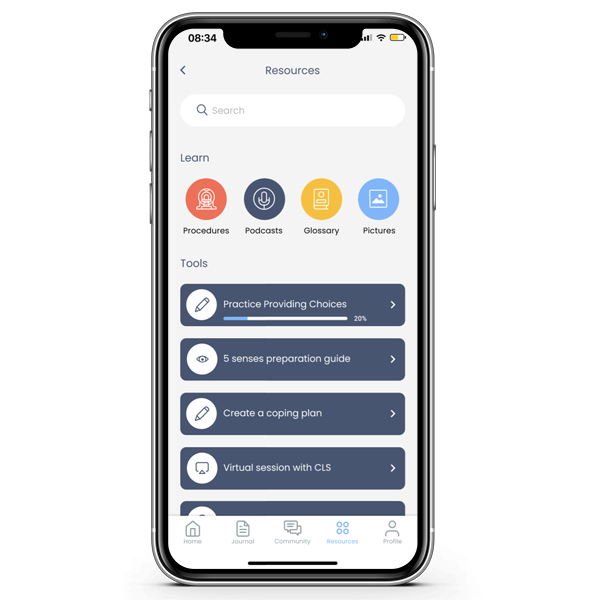
My Process: I reviewed the pre-existing app and found the resource section which already includes “Tools”, “Resources” and “Learning”, which would be a logical and natural place for the user to find a new feature or function that is related to learning. The UI components and flows can be replicated thus saving time and budget traditionally associated with new components.

Competitive Analysis
THE APPROACH
- I researched competitor applications reviewing their strengths and weaknesses in features. Several had different approaches to the same problem. Some were more limited in terms of dealing with specific or limited issues.
THE REASONING
- To identify why the use of a guided tool or script would be helpful in facilitating communication between parent and child before clinical engagements.

Interviews
User Interview Reasoning
THE APPROACH
- Conduct first-hand interviews with parents who have had children in the hospital
THE REASONING
- It will provide knowledge of the challenges and concerns, mindset, conditions, and challenges parents face.
SME Interview Reasoning
THE APPROACH
- Conduct interviews with Child Life Specialists who normally lead these situations
THE REASONING
- To gain empathy on the full picture of Child Life Specialists and the patient experience not only in hospitals but on the new Child Life on Call application.

FINDINGS
When a parent meets a Child Life Specialist, it’s often the worst day of their life. Something significant has happened. They often don’t know what to say or do
INSIGHTS
It’s important to meet the users at their emotional level
DESIGN DECISION
Words have to be comforting, reassuring, honest, and informative. Building in prompts at key times can help address the needs of users at different points in the journey of understanding their mental state and needs at various times
FINDINGS
Parents/ caregivers are a key part of the process in helping the child understand what’s going on, provide support, and help advocate on behalf of the child. Many get stressed and overwhelmed by many aspects of that in not knowing what to do or what’s going.
INSIGHTS
Giving the parents useful information on what to exactly say and do (not suggestions), will not only reduce their feeling of being overwhelmed, and exhausted but help them feel confident and knowledgeable.
DESIGN DECISION
Add a parent guide section in which the app provides an exact language for various scenarios, what to do and not to do, conversation approaches, questions they can ask, sample coping strategies, and ways they can advocate for their child.
FINDINGS
Parents/ caregivers can often bring in their own fears and anxieties and the kids can pick up on that and mirror it
INSIGHTS
Helping parents remain calm and knowing when and where to have certain conversations can help make the patient experience a more positive
DESIGN DECISION
Within the new parent guide section, have tips on remaining calm, when and where to have conversations with staff
FINDINGS
When in the hospital kids lose all control of their life and stress builds up. The loss of control causes the patient anxiety and parents/ caregivers/ families often feel or take on that stress
INSIGHTS
Providing parents with ways they can help their children feel like they are in control to a certain extent will help the patients and parents feel less stressed and overwhelmed
DESIGN DECISION
Provide parents with tips, information, and samples of how they can offer their Child (patient) control over some decisions in various situations
FINDINGS
Parents often don’t know the best approach to talking with their patients & family and it causes them additional stress
INSIGHTS
The parents need help with communication to alleviate their stress and challenges
DESIGN DECISION
Provide ways for parents to communicate, and support siblings, as well as ways to have conversations
Personas
My Process: The persona “Dan” cares very much about his daughter, but is not really sure what to do or how best to help. He’s motivated to help his daughter but also has some preconceived feelings about being in a hospital.

02
DEFINE
Empathy Map
My Process: I used information from my research, and interviews with parents, and SMEs to build an empathy map to get a sense of what a user is doing, thinking/ feeling, pains, gains, hearing, and seeing to help guide the user centrist design process.

Customer Journey
My Process: I wanted to get a sense of the customer journey to help understand the emotional experience, thoughts, goals, and actions of the user. This tool will be used and reused to guide my process.

Value Proposition Canvas
My Process: I used a value proposition canvas to show how the company’s product and service intersect with the user’s desires and expectations. I wanted to make sure they were a good fit between what I was offering and why people would use the app.

03
IDEATE
Project Goals
My Process: I created a chart to visualize the project goals of the new feature and how the user, the business, and the technical considerations are accomplished and overlap.

Page Sketches
My Process: After speaking with the product owner, I became aware of the budget challenges. I, therefore, sketched concepts that utilize the existing app structure, components, and flows. The new features and functions continue the existing overall brand look and feel, “Trauma-Informed Care” was very important to the product owner, and the concepts I created continue to promote this idea.

User Flow
The Goal: I wanted to create user needs and goals into steps inside the product. This would help me see the bigger picture without getting stuck on the details.
QUESTIONS ASKED
- What do our users need?
- What features are the most relevant to them?
- What problems are users looking to solve?
- What objections and reservations might your users have?

Task Flow
My Process: For this project, there were multiple task flows. Here’s one for sharing a video. Parents or caregivers can share the information with their spouses or other family members so they can learn what to do.

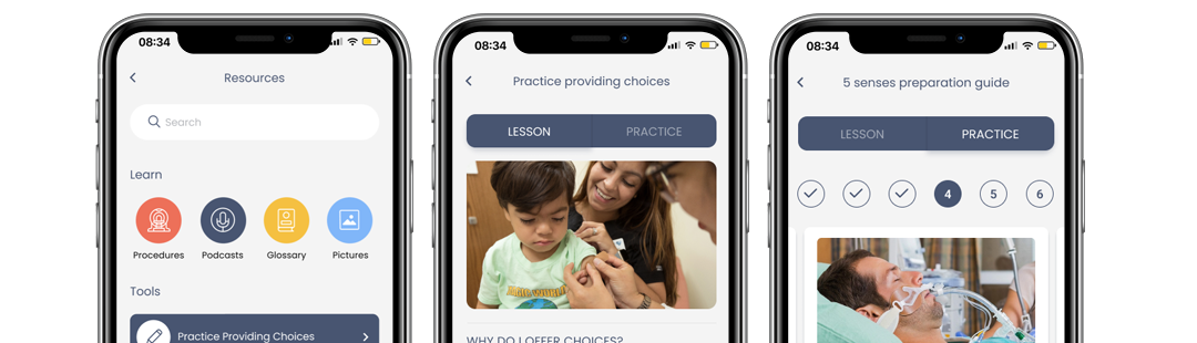
Wireframes
My Process: I created wireframes and added annotations for each frame.
- The parent will get a sense of potential common scenarios they will likely go through with the patient at a hospital
- The parents will be able to learn and practice how to provide choices that can lead to better outcomes.

UI Kit
My Process: A UI kit was developed with components and auto layout. These components become the building blocks for the site and act as a style guide. With components, I can make vast changes on multiple screens easily.

04
PROTOTYPE
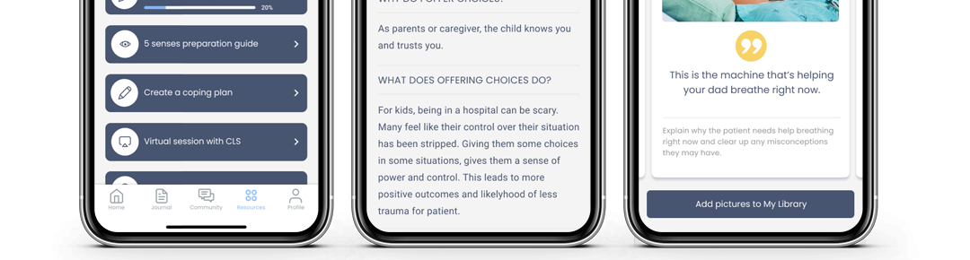
High Fidelity Prototype
My Process: I created a high-fidelity mockup and prototype with five new features and functions:
- Practice Providing Choices
- 5 Senses Guide
- My Library
- My Hospital Map & Guide
- How to Videos
The colors, style, branding, and functionality are consistent with the current app. The challenge I faced was trying to allow the user to practice what to do and what not to do without feeling like they were being graded.

Figma Prototype
My Process: A high fidelity prototype was built for two reasons:
- To be used in the usability test scenarios
- To be shared with the product owner
05
TEST
Usability Testing Plan
My Process: The users in my usability test were not real parents or caregivers in a serious healthcare scenario. Therefore, it would be difficult to test their stress and confidence in the app. I hence decided to create A/B tests to measure the success of the format of the quiz feature and whether it generated a different outcome or feeling from the user.

Affinity Map
My Process: I organized the notes, comments, and feedback from the usability tests into an affinity map with 4 sections: Suggestions, Success, Patterns, and Confusion/ Frustration. These notes help understand the user’s experience and where and how the design can be refined.

Iterations
Finding: Users thought the 5 senses were too text-heavy, hard to navigate, and wanted actual words to say.
Insight: Changing the format may make it easier for users to understand and navigate.
Design Decision: Show a larger image to correlate with samples of actual words to say and further explanation. Allow the users to swipe through the samples while still having access to add pictures and easily navigate back to the lesson.

Iterations
Finding: Users tended to skim or skip the intro “lesson” because it was text heavy paragraph and went straight to the practice button.
Insight: The lesson was seen as less important.
Design Decision: Replace the button with a toggle to allow the user greater flexibility to go back and forth. Then change the format to scrolling question tiles and answers so users can digest it easier.

Iterations
Finding: Users felt like too many pages and didn’t like pressing “back” so much
Insight: Too many steps and complicated navigation raised user frustration
Design Decision: I lessened the number of pages to navigate by using an internal swipe for the practice questions, thus keeping the user on the same screen.

Iterations
Finding: Users got confused about the practice samples and the transition into questions. They also felt there was too much text and didn’t know what to do.
Insight: A better transition, format or introduction would be less confusing to users.
Design Decision: I reformatted the practice questions to one style for an easier transition. After a user selects the choice and submits it, it explains (in red or green) the outcome of that choice.
Iterations
Finding: Similar to practice providing choices, users tended to skim or skip reading this information and went straight to the button. The users were also confused by the hero image.
Insight: The format of the intro or lesson was seen as less important.
Design Decision: Replace the button with a toggle to allow the user greater flexibility to go back and forth. Then change the format to scrolling question tiles and answers so users can digest them easier. Add a hero image that correlates with the lesson.

Iterations
Finding: Users missed “Room 401”
Insight: Room 401 does not stand out and can be changed to be easier to see.
Design Decision: I made the room location type bigger and boxed it off to bring more attention.
Noteworthy: I added a few other additional options to the provided choices based on feedback from users.

Iterations
Finding: Users noticed two sections of images
Insight: Having two image sections (My Library and Pictures) can be confusing to the user.
Design Decision: The My Library was incorporated into the existing framework of the Pictures section and a My Library tab replaced “Popular”

Conclusion
Insights: Because the actual app is just launching in a testing format, I was not able to use actual app users for the usability tests and it was difficult for those users to pretend to have the same mental state as actual app users.
What I learned: It helps to have the usability test users play with the existing app before showing them the prototype.
What could I have done differently: I was limited on this project due to time and circumstances. The revisions I made are currently my best guess at how to address the concerns (for example, no direct inputs informing the directions taken and no second-round testing to confirm if the iteration works any better than the original). It would have been great to have more direct inputs.
Challenges: The product owner was initially interested in me researching the playroom games. I had to let her know I was not able to change or offer games. I instead came up with a new feature.
What next steps would you take to further improve the project: I would like to do a second round of testing and get feedback from Child Life Specialist and the product owner. I would also like to test the use of videos for learning lessons.
Key Takeaways: Simplifying content into digestible chunks of information as to not overwhelm the user.
What am I most proud of: I really enjoyed doing the interviews with the Child Life Specialists and feel like I attained really good- useful information for the project.
READ MORE
Case Studies

NextGen Healthcare
A web-based EHR that includes e-prescribing, connections to labs, billing, and reporting for small practices.

getBetter
A mobile app that guides users to recovery post foot surgery

Patriots First Foundation
A responsive website that nutures donor behavior