![]()
Background
Kaus has 30 years of experience in the industry, so knows the product well. They enter a market with stiff competition, but they are willing to try to innovate approaches to capture customers. They are prioritizing user experience to differentiate from competitors. They want to focus on younger consumers.
The Problem
WHAT THE CLIENT NEEDS TO CHANGE
Kaus wants to move from B2B sales of their insurance products to direct to consumer sales.
Design a new modern website and fresh logo for the company.
Design a responsive e-commerce website that is pleasing to use and that allows customers to browse through all products and easily filter by relevant data.
Hypothesis
POINT OF VIEW TO BE PROVED OR DISPROVED
Young people (ages 18-34) are equally interested in all types of insurance policies offered.
Young people (18-34) are more interested in bundle packages than customized packages.
Young People (18-34) are the only age group using internet, personal devices to buy/research insurance and therefore a rebranded look will attract them and help the company catch up.
Research Goal
WHAT WE HOPE TO ACCOMPLISH
We want to know how young people make decisions using digital technology about insurance so that they attain a growing digital market share.
Research Objectives
HOW WE WILL GET THERE
Through research, we hope to understand all digital users and how they make decisions regarding insurance.
MY ROLE
- UX Researcher
- UX/ UI Design
- Branding
TOOLS USED
- Figma
- Adobe Illustrator
- Miro
DURATION
- 80 Hours
Research Plan
My Process: A research plan was developed and created with the goal of understanding how young people make insurance decisions using digital technology.

01
EMPATHIZE
02
DEFINE
03
IDEATE
04
PROTOTYPE
05
TEST
01
EMPATHIZE
Interviews
User Interview Reasoning
THE APPROACH
- Conduct firsthand interviews with young people who have purchased insurance
THE REASONING
- It will provide knowledge of the interests and concerns of the focus demographic
Interviews
SME Interview Reasoning
THE APPROACH
- Conduct SME’s with a professional Insurance Agent
THE REASONING
- Understand the experience of dealing with young users (18-34), the services they tend to be interested in, and whether the bundle offerings make the most sense.

Competitive Analysis
THE APPROACH
- Do market research on other insurance competitors and analyze features and what impact they make on decisions
THE REASONING
- The pricing and the information may be the same or similar to competitors, but understand what causes a user to sway their decision

FINDINGS
Despite stage of life, 73% of users interviewed got two or more quotes before making a purchase decision.
INSIGHTS
Help user’s feel empowered: they are in control of their decisions on how to spend their money and what’s best for them.
DESIGN DECISION
Offer the users 3 quotes at the same time at varying levels of price and coverage while also incorporating other ways to save.
FINDINGS
The claim process is super important to customers and a bad experience can cause users to change providers.
INSIGHTS
Allow users to file a claim online or via phone with an agent. Where and how to do this needs to be obvious, simple, and fast.
DESIGN DECISION
Place on the homepage in a prominent spot with clear words “File a Claim” and use an icon to help communicate the message.
FINDINGS
Users want the quote process to be fast, simple, and not difficult to understand. They also want to trust the process.
INSIGHTS
Communicate to users the time it takes to get a quote. Users trust online reviews as much as word of mouth.
DESIGN DECISION
Post a video link – how to get a quote and state the time it takes. Show reviews from other customers to help build trust.
FINDINGS
The stage of life the user is in, greatly affects the type of insurance products the user is interested in.
INSIGHTS
Users might be swayed into additional purchases if they physically see the pricing and the coverages for other options
DESIGN DECISION
Show three-tiered pricing with some information grayed out (unavailable for that quote).
Personas
My Process: Information from interviews was used to create a persona: “Christine.”
Findings: The goals and needs of users were different based on their stage of life. Young users would be less likely to purchase an umbrella policy if they did not have children or own a home.

02
DEFINE
Empathy Map
My Process: Upon creating personas, an empathy map was created to get a sense of what they user is doing (on a typical day), thinking and feeling (what’s important to them), seeing (in their environment), hearing (what influences them), their pains (what challenges they have) and their gains (hope to achieve and or measure success).

Card Sorting
Objective: To understand how users fit content into an existing structure. The results will be analyzed to help create an experience that is simple and easy to use.
Findings: All participants grouped a few of the same cards together in regards to insurance types, claims, and quotes. There were major differences in the grouping of the quick links as well as things to do under sign-in.

03
IDEATE
Sitemap
My Process: Upon completion of the card sorting, a sitemap was created. This sitemap was used as a guide for the next phase of identifying tasks.
Noteworthy: This sitemap eventually changed after conducting usability testing.

Sketches
My Process: I did several rounds of sketches and annotated them.
Sample Findings:
- Have minimal distractions to minimize friction/ funnel attention
- Reinforce user concerns on the quick links
- Use line art to appear fun, friendly, and approachable
- Validate user concerns with reviews – users treat online reviews as if coming from a friend.

Task Flow
The Goal: To identify the steps the users would follow to complete the main task(s). In this case, the main task is to purchase insurance.

User Flow
My Process: The goal is to make the quote process simple to encourage success.
I wanted to make sure I included rescue features as well as ways for users to start over and go back if needed.

Wireframes
My Process: Wireframes were created for the insurance purchase flow. Annotations were added calling out some considerations and/or decisions that were informed by research. Some breakpoints were identified for the responsive design process that gives a consistent flow and user experience despite the device. Consistent grid sizing was used to help further give consistent experience.
Research Driven Insights:
- Addition of customer reviews to help influence decisions
- Show a video on how to get a quote and how much time it takes
- Secondary tasks and needs
- Validation of lender information

Low Fidelity Prototypes
My Process: Low fidelity prototypes of the mobile concepts were created to get a sense of interactions between screens.
Findings:
- The grid and columns will have to be adjusted to have design consistency over various devices

Brand Ideas
- Rounded font to match illustrations
- Warm friendly vibe with personality
- Overlapping elements for dimension
- Line art – few photos – make it playful
- Bright colorful buttons
- Icons with colorful accents

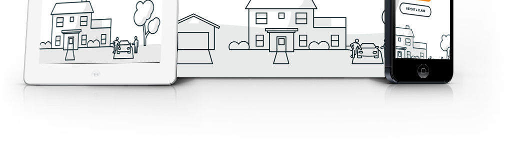
Brand Icons
My Process: Fun line art illustrations were created to appeal to the younger demographic. The brand color scheme was incorporated to make them pop and have consistency.
Brand Logo
My Process: A new logo was created in a rounded typeface that is playful and fun. The “a” has a handle like a magnifying glass to reinforce search and an eyeball to emphasize the user is looking and finding.

Brand Colors
Rationale: Colors play an important role in how your brand is perceived. In color psychology, the color blue is associated with “trust.” For insurance, trust is an important aspect.
PMS colors were chosen for the main brand colors to allow flexibility for Branding and print purposes. A blue and teal scheme helps appear feminine yet masculine.

Brand Typography
Rationale: To reinforce the fun, friendly vibe of the brand, Gotham Rounded and Roboto were chosen. They also bring good legibility and contrast.

UI Kit
My Process: I set up a UI kit within Figma with components and auto layout. They were used as building blocks for the site as well as a style guide. Using components, I can easily make large-scale changes to the design.

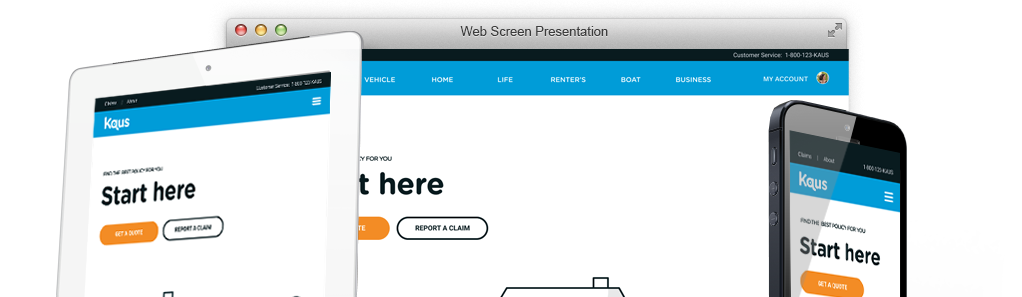
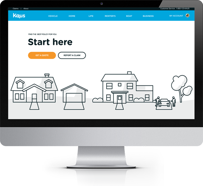
Responsive UI Design
My Process: All of the brand concepts were assembled and incorporated into the homepage design. Responsive designs (desktop, mobile and pad) were evaluated for breakpoints, brand consistency, transitions and general size & spacing of text.

04
PROTOTYPE
High Fidelity Prototype
My Process: I built a high fidelity mockup and prototype to be used for the usability testing. This included mockups for three scenarios and two flows.

Figma Prototype
My Process: The prototype will be used for usability testing and sharing with the stakeholders.
05
TEST
Usability Testing Plan
My Process: A usability test plan was created with an an introduction, script, and pre-planned scenarios and follow up questions.
Participants were recruited to test the usability of the prototypes.
The users were given three scenarios. The sessions were recorded and notes were taken on the actions of the participants.

Affinity Map
My Process: I organized the notes, comments, and feedback from the usability tests into an affinity map with 4 sections: Suggestions, Success, Patterns, and Confusion/ Frustration. These notes help understand the users’ experience and where and how the design can be refined.
I then prioritized the iterations and proceeded to make iterations.

Iterations
Finding: Users wanted to get their information faster
Insight: The users might benefit from seeing all insurance offerings
Design Decision: The navigation was updated to show all insurance offerings

Iterations
Finding: Users wanted to get to their information faster.
Insight: Users might benefit from having their second most popular task to be as CTA button.
Design Decision: “Start a Claim” button was added next to “Get a Quote” and the words “Start Here” were added to prompt user attention.

Iterations
Finding: The users felt the icon headers didn’t tell them where to go.
Insight: While the headings were concise, they didn’t speak to the users’ needs.
Design Decision: The titles for the headers were changed to speak to user needs. The policy was changed to higher priority need of printing ID cards

Iterations
Finding: Users wanted the ability to save a quote and get back to it. They also wanted clearer options to start over or go back. The “My Quote” title also didn’t highlight the comparison aspect.
Insight: The users missed out on some extra features and functionality they thought would be helpful in using the site.
Design Decision: I changed the header wording to “Compare your quotes”, and added a “Back and “Start Over” button as well as an ability to save a quote.

Iterations
Finding: The users didn’t like signing up with their email address before the quote.
Insight: Users wanted to get a quote before giving their information
Design Decision: The location of this page was changed to later in the purchasing process

Conclusion
Insights: Users want to get what they need and be able to do it fast and easily.
Challenges: Insurance involves asking lots of questions and information and then allowing users to see compare that information at the same time to make a decision.
What I learned: Break things down into simple steps so as to not overwhelm the user.
What could I have done differently: Explore the options to expand and hide details of the quote to allow the user to see the price and get the details if they want.
What next steps would you take to further improve the project: Further testing the home page post changes made at the usability test.
Key Takeaways: Allow the user to edit or start over just in case they wanted to make changes.
What am I most proud of: The idea to simplify the questions one at a time and making the next button inactive until they answer the question.
READ MORE
Case Studies

NextGen Healthcare
A web-based EHR that includes e-prescribing, connections to labs, billing, and reporting for small practices.

Child Life on Call
A mobile app that supports parents preparing their child for a hospital visit

getBetter
A mobile app that guides users to recovery post foot surgery