![]()
Background
During my wife’s bachelorette party, my sister-in-law broke both of her legs in multiple places while jumping into a pool. Instantly her world completely changed. Four years later, she continues to struggle to fully heal. The process has caused her much anxiety resulting in further issues.
The Problem
WHAT THE CLIENT NEEDS TO CHANGE
Patients with serious leg and foot injuries can have a long road to recovery. Surgery alone does not always guarantee recovery. When doctors release patients post-surgery, they don’t always realize the patient understands what they are saying and follows up on important medical details or instructions to help recover. Some recoveries can take a long time and a concentrated effort. This communication breakdown and lack of focus can cause patients to have more anxiety and struggle to recover.
Hypothesis
POINT OF VIEW TO BE PROVED OR DISPROVED
Having a step-by-step guide with information, activities, videos, reminders, exercises, motivation, feelings, and social support for the medical treatment process helps ease the patient’s anxiety and provides crucial information for patients for recovery.
Research Goal
WHAT WE HOPE TO ACCOMPLISH
- Learn how to engage users to keep them on track with recovery
- Present the information to users in an accessible, easy to use tool that helps them take the next steps in the recovery process
Research Objectives
HOW WE WILL GET THERE
- Understand what are the causes of patient anxiety
- Discover ways to keep users informed, engaged and focused on the recovery
MY ROLE
- UX Researcher
- UX/UI Designer
- Branding
TOOLS USED
- Figma
- Adobe Illustrator
- Miro
DURATION
- 80 Hours
Research Plan
My Process: A research plan was developed and created to identify the problem, create a hypothesis, and establish objectives.
Questions:
- What motivates a user to do the necessary steps
- What do they need to see to indicate progress

Project Roadmap
My Process: I created a schedule of what would be produced and accomplished. This helps the project keep on time and budget.

01
EMPATHIZE
02
DEFINE
03
IDEATE
04
PROTOTYPE
05
TEST
01
EMPTHAIZE
Competitive Analysis
THE APPROACH
Do market research on several competitor apps for analysis
THE REASONING
To get a sense of how they addressed patient anxiety and confidence which are the main variables I am trying to shift

Interviews
User Interview Reasoning
THE APPROACH
- Conduct first-hand interviews with people who have serious leg and/or foot injuries
THE REASONING
- It will provide knowledge of the challenges and concerns patients have post-release and understanding next steps
SME Interview Reasoning
THE APPROACH
- Conduct interviews to understand the challenges medical personnel has in patients and ways to help them recover.
THE REASONING
- SME’s see patients all the time and have an understanding of what the experience is like and what it takes to recover or not

FINDINGS
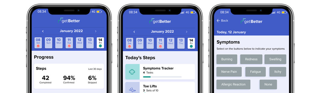
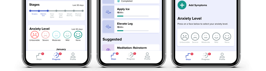
The stages a patient goes through are injury, Surgery, Stitches out, Done with Splint, Boot 70/30, Boot 50/50, Shoes, Review/ Recovered
INSIGHTS
These stages give the user a sense of what to expect and achieve
DESIGN DECISION
Acknowledge each milestone (as well as other minor ones) to help reduce the anxiety the user may have
FINDINGS
To heal, a patient should follow a daily regimen
INSIGHTS
Having a daily regimen via the app including medication, icing, elevation, exercises, and others would be helpful in reducing anxiety and keeping the patient on track to heal
DESIGN DECISION
Have the main page they land on (after creating an account) be the day’s activities and the user needs to check these off
FINDINGS
Users are not always great at typing on a smartphone
INSIGHTS
Having preset words, phrases or icons that the user can select, can save time and thus be less taxing on the user
DESIGN DECISION
Allow the user to tap to select as well as add a phrase and then submit for the record
FINDINGS
The patients may not be able to walk but may have use of hands
INSIGHTS
A smartphone app could be something they use regularly to communicate, entertain, get info, and or document their challenges
DESIGN DECISION
Create an app to help users have less anxiety and know what to expect
FINDINGS
The healing can take months or a year
INSIGHTS
It would be helpful for the user to be able to document symptoms, anxiety, questions, and or notes
DESIGN DECISION
Include sections to add symptoms, anxiety, and others. Allow user to see via a chart and or stats be able to see progress and communicate with Doctor
FINDINGS
The paperwork currently given to patients does not show users how to do exercises
INSIGHTS
A user might find it helpful to know how to do exercises properly
DESIGN DECISION
Include a video on how to do exercises
Provisional Personas
My Process: I focused the demographic on users who were most likely to use the app. The users were grouped into six categories:
- The Stubborn
- The Too Busy
- The Motivated
- The Caretaker
- The Needs Encouragement
- The Needs Assistance

Personas
My Process: I created a persona named “Theresa” to help guide my process. I identified her goals/ needs as well as frustrations and fears. Her archetype is ” The Needs Assistance.”

02
DEFINE
Empathy Map
My Process: An empathy map was created to get a sense of what the user is doing, thinking & feeling, seeing, hearing, and her pains & gains.
This information will be used to ideate potential solutions in the design.

Customer Journey
My Process: I created a journey map using both the personas and the empathy map. I wanted to get a sense of the stages, and the anxiety level.
- Injury
- Surgery
- Stitches Out
- Done with Splint
- Done with Boot
- Weight Bearing (Shoes)
- Review

Page Sketches
My Process: I did several rounds of sketches. In doing so, I realized the redundancy for the journaling feature (it can be accomplished on the symptoms section). I decided to remove journaling from the main navigation thus saving time building unnecessary screens.

03
IDEATE
Wireframes
My Process: I created wireframes with detailed annotations. I made UI decisions based on insights, user needs, and other research information:
RESEARCH-DRIVEN INSIGHTS
- Include videos on how to do certain exercises
- Motivate the user based on submissions
- Suggest activities to lower anxiety

Icon Set
My Process: One of the brand’s goals is to help users have less anxiety. To ease anxiety, the icons were designed to be fun and friendly.
- Rounded strokes
- Bright inviting colors
- Simple recognizable shapes
- Consistent size
Mood Board
- Healthcare uniform colors
- Bright optimistic feeling
- A soothing vibe
- Copy is written in 6th-grade reading level
- Line art
- Bright colorful buttons
- Icons with colorful accents
- Encouraging tips

Brand Logo
My Process: I started off with pencil sketches. I wanted to logo to be instantly recognizable, convey healthcare, healing, and be optimistic. After a few ideas, I started to see potential in one.
The brand name is a call to action. It appeals to their desire to heal. The word “Better” is bolder than “get” as a reference to being stronger and having more health.
THE BRAND ICON HAS A TRIPLE MEANING
- It shows a hint of a cross (associated with healthcare)
- It shows steps referencing the step by step guide to get better
- The gradient changes color indicating healing over time.

Brand Colors
Rationale: The color scheme features colors often associated with healthcare. This helps reinforce the confidence and efficacy of the app with the user.
BLUE
- The color a surgeon wears
GREEN
- Associated with health, growth, and nature.
PURPLE
- Associated with calming, inspiration, and uplifting
ORANGE
- Associated with optimism and happiness

Brand Typography
Rationale: To help ease a user’s anxiety, I chose Proxima Nova.
- It has multiple styles and good legibility
- Friendly vibe = trust
- Sans serif = modern

UI Kit
My Process: I developed the components to be used as building blocks for the app. They act as a style guide and an easy way to make full-scale changes to many elements.

04
PROTOTYPE
High Fidelity Prototype
My Process: I built a high-fidelity mockup and prototype to be used for usability testing. This included mockups for three scenarios and two flows.

Figma Prototype
My Process: I used Figma to build a prototype.
05
TEST
Usability Testing Plan
My Process: A usability test plan was created with an introduction, script, and pre-planned scenarios and follow-up questions. Participants matching the demographic were recruited for the test. It was recorded and notes were kept.
Usability Test & Results
My Process: Participants matching the company demographic were recruited to test the usability of the prototypes.
The users were given three scenarios. The sessions were recorded and notes were taken on the actions of the participants.

Affinity Map
My Process: All of the observations, notes, and comments were organized into an affinity map to identify pain points.
The list addressed issues on several major screens. The list was then organized into actionable items. Iterations were implemented and sent for further testing and review.

Iterations
Finding: The users felt the finger scrolling was not easy to navigate, especially for longer than one prior week.
Insight: The calendar feature needs to be simplified in order to not cause user frustration.
Design Decision: Instead of scrolling the calendar by individual days, when you click on the arrow, it does the whole week. This moves faster. To do so, we change the number of days showing from 5 to 7.

Iterations
Finding: 0% of the users clicked on the watch demo link and went straight to the start button.
Insight: The watch demo link was hard to see. In addition, a user would need to go “back” to watch the demo adding an extra step.
Design Decision: The watch demo link was moved to the exercise screen. The start button was removed and the whole box became clickable to start the exercise. A progress bar or “completed” replaced the percent completed text to be more visual.

Iterations
Finding: Medication was listed with a “Done” button to click (as compared to the “Start” button on other steps. It feels out of place.
Insight: The medication “Done” button was confusing and maybe better not viewed as a step.
Design Decision: Medications were moved out of the Steps and converted to a pop-up alert via Steps in the bottom Navigation.

Iterations
Finding: 100% of the users were able to log in and complete all of the steps.
Insight: Users felt “Symptoms” should go first as if they don’t feel well, it may affect them doing the other steps.
Design Decision: Move “Symptoms” to be the first step.

Iterations
Finding: 50% of users misinterpreted the scenario and selected login instead of signup.
Insight: The order and style can be rearranged to be less confusing
Design Decision: Sign-up was moved to the right and the log-in was made white to stand out more.

Iterations
Finding: Users wanted to see stats on their progress, not just what stage they were in.
Insight: Stats help convey accountability to the user and progress to the doctor.
Design Decision: Stats showing steps completed, percent completed and percent skipped were added. The design of the stages was changed to a bar format so users can see how completing one stage leads to the next.

Iterations
Finding: Users felt the chart was backward (users read left to right and moving to the right is often viewed as progress.
Insight: The chart was misleading and can be reformatted for easier interpretation.
Design Decision: The order of the faces was switched (“Unbearable” on the left and “None” on the right). The chart was also reversed so that “None” (healed) is at the top on the right.

Iterations
Finding: Users felt the “Meditation” should not be a step or should have a skip option. They also wanted to see a timestamp reference for flexibility.
Insight: “Meditation(s)” should be removed from the steps and only show up under “Suggested” if the user selects a high anxiety level
Design Decision: Make “Meditation” a “Suggestion” (not a step) based on the anxiety level of the user. if severe/ unbearable, then these should be recommended. Add a few of them at different time lengths to allow for user flexibility.

Iterations
Finding: Users were confused if the start button was also a pause and if yes, why have a finish button.
Insight: The finish button is not necessary if the user pauses the exercise, the progress bar will show up at the same level.
Design Decision: The finish button was removed and the play/pause was made larger. The watch demo video link was moved to the actual exercise screen to save the user from having to go back.

Conclusion
Insights: It’s important to remember the order in which things would be completed first in regards to placement on a frame or in continuous frames, thus saving the user from going “back.”
Challenges: Thinking about hand movements, touch, and how it affects design.
What I learned: Be mindful of buttons interfering with the ability of the user to scroll the page.
What could I have done differently: I wish I did more research on commonly used design patterns for steps or stages. This project had time constraints.
What next steps would you take to further improve the project: I would do more user tests overall but especially on the exercises.
Key Takeaways: I need to get better at auto layout so that spacing is built into my design.
What am I most proud of: I feel the usability test scenarios and questions led to good feedback which resulted in positive changes.
READ MORE
Case Studies

NextGen Healthcare
A web-based EHR that includes e-prescribing, connections to labs, billing, and reporting for small practices.

Patriots First Foundation
A responsive website that nurtures donor behavior

Child Life on Call
A mobile app that supports parents preparing their child for a hospital visit